Category Archives: Random

10 Usabilty Facts You Need to Know

Usability can be directly linked to your website’s success. This is due largely because the usability of your website affects your visitors’ perception and their effectiveness when they are on your site.

Listed below are 10 usability facts that will help your website succeed.

10 Website Usability Facts You Need

  1. Don’t make a visitor think, the first law of usability. The visitor should be able to understand the site, page, or application without thinking what they are being asked to do.
  2. Don’t make your visitor feel stupid if there is an error. Design the website functions to be error free but when errors happen design useful messages that help the visitor correct the mistake and move on.
  3. Don’t place important information in images. Visitors will ignore anything that looks like a banner even if it isn’t an advertisement.
  4. Visitors to your site are looking for trigger words that they think will get them closer to completing their task. Websites with clear labels and navigation options help drive the visitors forward in their effort to task completion.
  5. Remember, visitors don’t read the pages of your website they scan trying to be as efficient as possible. Think about your own reading patterns when arriving on a site your eyes immediately start bouncing around the page looking for your trigger. Don’t rely heavily on text and instructions to make something understandable.
  6. Visitors make bad choices, click the wrong link, select the wrong product, skip the wrong field, etc. Make sure your site is forgiving when these bad choices happen. Help the visitor get back on track building their confidence.
  7. Keep your website’s navigation consistent on each page. This is one of the most important usability factors that can be offered to your visitors.
  8. The homepage is not your website’s only entry page. Your site needs to make it clear to visitors which page they’ve landed on and its relation to the rest of the site.
  9. Keep your information short and in small digestible chunks. Since visitors are skimming your site use short paragraphs, bulleted lists, and subheadings to make a page easier to scan.
  10. And finally.

  11. Making your website usable to visitors will have a positive impact on your business and will lead to a larger Return on Investment. Estimates on ROI impacts have been as high as 10 fold.

Contact me if you’re interesting in learning more about usability design, best practices, or how usability can increase your ROI.
New Service: Website Reviews

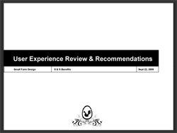
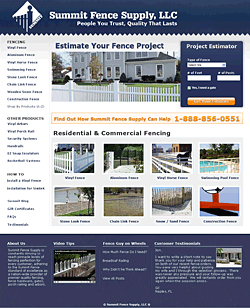
Just a quick post to share a new service I’m offering at Small Farm Design: Website Reviews.

Read about the website review service

The review offers your business an economical way to increase the performance of your website. You’ll receive a document that outlines problems that are causing user frustration with clear an actionable ideas on how to correct the problems.

Each Website Review includes:

  • Simulated Eye Tracking
  • High Level User Experience Review
  • Key Takeaways to Improve Problems

If have interest in having your website reviewed or if you want to know more about the service, simply order a review, drop me an email, or give me a call at 330.241.9357.

Does Your Homepage Leave a Lasting Impression

Find out what kind of impression your homepage is leaving. Evaluate your homepage now.

First impressions count and online they count for a lot. The homepage is what is seen by many visitors when first arriving at a website. This initial impression will lead to either a lasting positive or negative impression that will affect their decision to continue using your site.

The most important aspect to be aware of is the goals of the site, and in this case the homepage. Having a grasp of what the visitor is trying to accomplish is key to getting the design right.

Designing a homepage is as much a science as it is an art form. It requires attention to detail, putting focus in the site’s purpose and goals, and taking into account the tasks the visitor wants to complete.

How does your current homepage rate?

You can get a better understanding of what is and what isn’t working on your current homepage in about 5 minutes. By taking the evaluation you should also gain insight into some best practice homepage design principles and ideas on how to improve your current homepage.

Get Started

Take the 5 minute homepage evaluation and see the kind of impression your homepage is leaving.


Does Your Website Pass the 5 Second Test

5 seconds isn’t that long of a time span. But it’s enough to cause your website visitors to question whether or not your website has what they want, answer if they should continue to explore your site, and give initial impressions of trustworthiness.

All that in 5 seconds? Absolutely.

Think about how you normally browse a site. Think about those initial moments after arriving at a site. Those initial feelings you have on whether or not you should continue are the same feelings your website visitors are having about your website.

What It Does

The 5 Second Test specifically focuses on the first few moments of a visitor’s interaction with a website or a web page. It is during theses initial moments that a visitor will decide:

  • Do I feel I can trust this site?
  • Is this where I thought I’d be?
  • Do I have confidence this site will help me complete my task?
  • Do I want to continue and explore further?

In 5 seconds you don’t get a whole lot but what you do get is a good idea if the page being tested is able to convey the message to your visitor. If the message isn’t conveyed correctly the visitor is gone.

Benefits of the 5 Second Test

  • Fast. Within a 30 minute period you will have a good set of data.
  • Capture true initial impressions. Showing the page for only 5 seconds eliminates the over-critical recommendations that
  • Able to be done in the early stages of design. These test can be done using nothing more than a print out of the design.

How it Works

A 5 second test is about the easiest usability test to conduct. The name itself is almost enough direction. But for the sake of clarity lets walk through the steps involved.

  1. Find a group of participants that you will show the page (or pages) to.
  2. Individually, show the page to the participant for, you guessed it, 5 seconds
  3. Remove the page and ask them what they page is about

Conducting a 5 Second Test

This test is so simple anyone can conduct this test. However, a word of caution. The 5 second test will be provide the most insight when conducted by someone experienced with conducting traditional usability tests. This is due to the nature of testing and getting meaningful data back. Running a clean test will provide cleaner data that is true participant feedback that isn’t influenced by the test giver.

Test that are not properly designed or not properly facilitated have the potential to produce results that are misleading causing design decisions to be made incorrectly.

Conclusion

If you have a homepage, landing page or content pages within your website that you think may be overwhelming, cluttered or just not clear in their intent a 5 second test may be in order.

If you would like help setting up or conducting a 5 second test drop us a line.

Excuse the Mess

After going through my site, putting band-aids on pieces and parts it has come to the point where I need to start clean.

I’m tearing into the site cleaning up the code,content and reworking the portfolio section. A project like this should only take a few days, however, due to my current project workload, it will most likely take longer. I guess it’s like the old proverb, the shoemakers’ children always go without shoes.

7 Ways Besides SEO to Gain Website Traffic

Today, having a website for your business is an important (maybe the most important) piece of your marketing plan, both online and off. Over ninety percent of large businesses and forty percent of small businesses have a site. However, just having a site doesn’t guarantee success.

7 Ways to Gain Website Traffic

  1. Your Employees:Your website has to be on the top of everyone’s mind throughout your organization. Directing everyday inquiries to the website is the first step in gaining more usage to your website.
  2. Voice Mail: Use your “on hold” message to direct people to your website. This is extremely important when a user calls after hours or on weekends when you are running with a slimmed down, or no, staff. Ask all your employees to mention the website in their personal message also.
  3. Press Releases: Send out a traditional press release after your site is launched and then periodically throughout the year on new site features and/or services to continue generating awareness.
  4. Magazines and/or Newspapers: Submit articles to your local magazines and newspapers to get the word out about your website.
  5. Advertisements in Trade Publications: If the audience you are trying to reach is more business to business run ads in market specific trade publications
  6. Email Communications: Requesting all employees list the website address in their email signature will help keep the word out about the website as well as develop a stronger brand.
  7. Awards: Submit your website for various awards. There are numerous sites that make it easy for you to submit your website. With a little luck winning an award will enable you to generate more press opportunities.

If your website is going unused and unnoticed the amount of effort you’ve spent on determining the site goals, designing the site, planning the navigation and usability, etc. is going to be wasted.

Contact Small Farm Design to help develop a website promotion plan.

The T-Shirt That Texts Back

Text SmallFarm to 41411

It’s always interesting to see creative thinking people bridge online and offline experiences.

For example I have created a t-shirt that has a question printed on the front along with a number that you can text message to. Which after doing so the person will receive an answer. In this case the user is prompted to go back online to Small Farm Design — making a complete bridge experience from shirt to phone to website