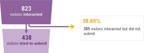
Here is a good example of what information and how it is collected dramatically influences potential customers.
ClickTale ran a small test on its own site around their sign up process and saw 39% of potential customers fallout at step 2 of the sign up process.
After digging in a bit deeper they saw that nearly all fallout occurred because of one (1) specific piece of information that was being asked for. Phone number. Even though this field was not marked with an asterisk nor required people were uncomfortable with the question, possibly assuming it was required, and chose to bail on the form rather than continue filling it out.
ClickTale’s designed a solution to explicitly call out that the phone number was optional. This one word change nearly doubled conversion rates (from 43% to 80%) and it decreased the 39% fallout down to only 4%.
This is a simple fix that had huge gains.
However, I wonder if ClickTale really needs to ask for phone number at all? If they aren’t going to use it, a better solution would be to remove the field entirely.
In either account, the way in which a website asks potential customers for information has a direct impact on how likely they are to convert.
If you would like help on designing forms that influence your customers and form best practices email me or give me a call at 330.648.FARM, to see how Small Farm Design can help.
