Why Features Are Problems

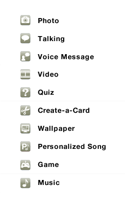
It has long been the notion that features sell more products. Logic suggests that if my competitor adds feature ‘x’ then of course I need to add feature ‘x’ plus feature ‘y’ and ‘z’ to create a better product. However, with each feature that gets added you also add complexity and choice.

choice01

Choice Leads to Decisions, Then Questions

Since a person has the choice of one product with feature ‘x’ and another product with features ‘x, y and z’ a person must choose which product and feature set they want. The person is forced to make a decision. “Do I choose ‘product a’ or do I choose ‘product b’?”

And with every decision comes a series of questions. “Does ‘product a’ do the same thing as ‘product b’ ?” “Do I need ‘feature z’, will I ever use it?”

Since most people are looking to validate their choice they will look to maximize the amount of value they receive. Assuming cost is the same, the product that has more features logically indicates that the person would be getting a better value (why would buy only one feature if I can get three at the same price?) by choosing it over the product with fewer features.

choice02

When It Becomes Too Much

However there comes a point when the number of new features adds so much complexity that they outweigh the product’s usefulness. The person begins to question how to use the product and if they will actually be able to complete their task. When this happens the person quickly becomes frustrated, throws their hands up in the air and begins to look for a simpler solution (What the F*ck Moment).

The person has lost all confidence that the product will actually let them do their job.

choice03

Elegant Solutions

So then how do you overcome this? By designing an elegant solution. An elegant solution is a solution focuses on what a person really cares about. The person doesn’t really care about any one feature instead they care about completing their task. Find a way that allows them to complete their task while at the same time feeling really good about themselves for doing it.

Don’t force the person to understand the complexity of your product, you do that. Let them be awesome.

Need Help Creating Elegant Solutions?

If you would like help creating elegant solutions that make your customers be awesome email me or give me a call at 330.648.FARM

Adding Features Isn’t Innovation

New features aren’t really innovations. They’re only new features. New features are like the toppings that get added to an ice cream sundae. Fun at times, but when you have too many you loose that simple bowl of ice cream.

Don’t ask can we, ask should we?

There comes a point in any product’s life cycle when small or “slightly better” improvements stop being meaningful to your customers. This point is called overshooting. When you overshoot you start adding clutter and confusion to your application and it quickly becomes frustrating to use and your customers start looking for something simpler. Think Microsoft Word.

Customers will almost always accept improved products or services, but when overshooting sets in, they won’t pay for improvements that used to be valuable to them.Scott Anthony – Harvard Business Review

Instead of bloating your website or application with a bunch of new features first ask yourself if any of them are solving a real problem your customers have. Are the features useful? Will your customs see the value in adding them? If the answers are no then you need to question why you are adding the features in the first place.

Sometimes removing features is the best innovation of all.

If you would like help on understanding how innovation makes sense for your business website or application email me or give me a call at 330.648.FARM.

What is the Value of a Wireframe?

Maybe you’ve heard you need a wireframe for a project or have used them in the past but now you are wondering what value does having a wireframe add?

I think this is a valid question. So what is the value of a wireframe?

Just because a wireframe gets created that doesn’t guarantee the project has been thoroughly thought through. A wireframe starts out as a thinking tool, at least for me and the way I use them. It is something that is a bit of a higher fidelity sketch. It is meant to serve as a conversation starter and to elicit questions and debates.

I find tremendous value using a wireframe to talk through ideas with both business and technology folks without getting caught up in the overall look and feel of the site. Using a wireframe at this point allows for more critical thinking on the core idea and less criticizing how something looks.

Quite frankly, anybody can create a wireframe. At its core the wireframe, as a design artifact, is nothing more than some boxes, text and maybe an arrow or two. However, a wireframe that is created by a User Experience Designer will still be boxes and text but each box will have been intentionally placed. Each decision will have been thought through critically to understand how it works with everything else on the page and how the placement can and will affect the users’ behavior. In short, the critical questions will have been asked, evaluated and tested.

It is important to realize that the wireframe only displays a static version of the page or application. A sort of snapshot of one moment in time a person experiences on your site. Consideration must be given to the flow that brings a user into your page or application, as well as, the flow leading out. In addition thought around what the user’s context is when they arrive on the page or within the application and the managing and matching of expectations going out. These behaviors and outcomes can all be planned for by using wireframes. This of course only works if the wireframes are more than just boxes and text.

Done correctly wireframes hold tremendous value. However, without understanding context, the overall site structure and the users’ expectations, wireframes hold no more value than some squares drawn onto a blank sheet of paper.

If you would like help on understanding the value of wireframes, or designing wireframes that make sense for your business website or application email me or give me a call at 330.648.FARM, to see how Small Farm Design can help.

How Form Design Affects Customers

Here is a good example of what information and how it is collected dramatically influences potential customers.

clicktaleimg

ClickTale ran a small test on its own site around their sign up process and saw 39% of potential customers fallout at step 2 of the sign up process.

After digging in a bit deeper they saw that nearly all fallout occurred because of one (1) specific piece of information that was being asked for. Phone number. Even though this field was not marked with an asterisk nor required people were uncomfortable with the question, possibly assuming it was required, and chose to bail on the form rather than continue filling it out.

ClickTale’s designed a solution to explicitly call out that the phone number was optional. This one word change nearly doubled conversion rates (from 43% to 80%) and it decreased the 39% fallout down to only 4%.

This is a simple fix that had huge gains.

However, I wonder if ClickTale really needs to ask for phone number at all? If they aren’t going to use it, a better solution would be to remove the field entirely.

In either account, the way in which a website asks potential customers for information has a direct impact on how likely they are to convert.

If you would like help on designing forms that influence your customers and form best practices email me or give me a call at 330.648.FARM, to see how Small Farm Design can help.

The Big Picture of User Experience

User experience (UX) shouldn’t be looked at on a project by project basis. It isn’t something that just gets done. UX is something that lives, breathes and grows. It doesn’t start at some point in the project life-cycle nor should it end when the project is complete. UX should be seen as a continuous thread that runs through the entire organization, from one project into the next always pushing to make the entire users’ experience better.

UX isn’t about being user advocates; it is about dollars and cents. However, money shouldn’t come at the expense of the users either. The goal of all UX activities is to make a product or service more desirable, easier to use, or more fun to interact with. This will in turn create an experience that persuades the user to open their wallet and pay for whatever it is being offered. Creating and understanding the UX strategy will enhance productivity, improve conversion rates, and deliver higher ROI. This can then be translated into reduced costs, higher income or both.

User experience is a big picture job. It takes time and dedication. It requires a person to look into the future in order to design an experience that is meaningful not only today but also tomorrow. It is fluid, moving and ever-changing. As such, our processes, tools and methods must be adaptable. But to be successful it is imperative to know where you want to go in order to create experiences that hold any meaning.

A UX strategy should be built for the long term and contain the following:
• the strategic vision
• mission statement
• key UX principles
• key objectives and areas of improvement

Clearly defining the above is necessary for the success of any UX strategy, the commitment from key stakeholders, as well as to generate an ongoing dialog about the strategy. Commitment is critical.

Ultimately UX must have an equal stake at the management table. This gives UX equal footing against the likes of marketing, development, product and /or other pressures. When this is not the case, UX becomes nothing more than a servant to another group within the organization and is at the mercy of the sponsor’s goals. In a servicing role UX quickly loses any notion of strategy and becomes less about the users’ needs and more about completing a task.

On the contrary when UX is truly part of an organization, on all levels, the UX strategy isn’t something that is forced, but instead it becomes second nature and is integral to everything that is done. This appears to be the case for more and more businesses today – Apple, Zappos and Progressive, to name a few.

This isn’t a power thing, it’s a business thing. Having a cohesive UX thread throughout an organizational culture can lead to much greater success.

Don’t Just Add Features Add Features That Make Sense

maristtaxipoll

A while back NYC added TVs to the back seat of cabs, however it appears they missed the mark.

The majority of riders either turn it off or simply ignore it. This is a good example of adding a feature without adding much value for the end user (or the cabbie).

Think how much more useful it could be if instead of reruns of Jerry Springer they allowed a rider to figure out the cab fare plus correct tip amount, directions, places nearby to eat, etc. Maybe for Manhattenites who use cabs on a regular basis, traffic status so they can communicate with whomever they are meeting about how late they will be, or a listing flight schedules (on time / delayed).

At times it’s hard to resist. Features are fun, sexy and cool. But all too often to get these features user experience is sacrificed. The role of any good UX designer or UX team should be that of dissuading teams from creating products that are bloated with features that most users won’t find useful or use.

Contact me if you’re interesting in learning more about usability design, best practices, or how usability can increase your ROI.

10 Usabilty Facts You Need to Know

Usability can be directly linked to your website’s success. This is due largely because the usability of your website affects your visitors’ perception and their effectiveness when they are on your site.

Listed below are 10 usability facts that will help your website succeed.

10 Website Usability Facts You Need

  1. Don’t make a visitor think, the first law of usability. The visitor should be able to understand the site, page, or application without thinking what they are being asked to do.
  2. Don’t make your visitor feel stupid if there is an error. Design the website functions to be error free but when errors happen design useful messages that help the visitor correct the mistake and move on.
  3. Don’t place important information in images. Visitors will ignore anything that looks like a banner even if it isn’t an advertisement.
  4. Visitors to your site are looking for trigger words that they think will get them closer to completing their task. Websites with clear labels and navigation options help drive the visitors forward in their effort to task completion.
  5. Remember, visitors don’t read the pages of your website they scan trying to be as efficient as possible. Think about your own reading patterns when arriving on a site your eyes immediately start bouncing around the page looking for your trigger. Don’t rely heavily on text and instructions to make something understandable.
  6. Visitors make bad choices, click the wrong link, select the wrong product, skip the wrong field, etc. Make sure your site is forgiving when these bad choices happen. Help the visitor get back on track building their confidence.
  7. Keep your website’s navigation consistent on each page. This is one of the most important usability factors that can be offered to your visitors.
  8. The homepage is not your website’s only entry page. Your site needs to make it clear to visitors which page they’ve landed on and its relation to the rest of the site.
  9. Keep your information short and in small digestible chunks. Since visitors are skimming your site use short paragraphs, bulleted lists, and subheadings to make a page easier to scan.
  10. And finally.

  11. Making your website usable to visitors will have a positive impact on your business and will lead to a larger Return on Investment. Estimates on ROI impacts have been as high as 10 fold.

Contact me if you’re interesting in learning more about usability design, best practices, or how usability can increase your ROI.

The Problem With Icons

Quick test. Don’t worry it’s easy.

Take a look at the image below and see if you are able to correctly identify what each icon is supposed to represent. Scroll down to see the correct answers. Be honest and no cheating.

How’d you do? If you’re like me I’m guessing not well.

The problem with icons is people associate different things with each icon based on their past experience.

But wait, I have a solution, hell I have two

1. Use a rollover or alt text to explain what each icon means.
2. Add a legend or key to explain which is icon means.

These are workarounds and are not real solutions. Reason is each solution relies on the site visitor caring enough to figure out what the icons mean. The first actually takes effort for the user to move the mouse, position the cursor just so and then, if using alt text, wait for the text to display. The second increases the cognitive load of the visitor and adds a fairly significant degree of friction. To use use a legend the user must first think to look for a legend (remember we looking at a website and not a map), then scan back to the icon, take a glance, remember then icon, scan back to the legend, and then find the matching icon and description.

In both solutions the effort seems to outweigh the actual value the icon is trying to provide. I believe there is a much better way to use icons.

The correct way to use icons

  • Use icons to show differences
  • Use icons to show the unique characteristics of products; not every characteristic
  • Icons should be used when it helps the visitor make a decision when choosing between multiple
    products (a way of narrowing selection)

Remember when using icons:

  • Label and image is better than just one or the other (image or text). However, if using only one text works better than just the image.
  • Icon images will be learned, the position of the icon is learned quicker. If you change the image, but the location remains the same , visitors usually won’t notice. However, if you change the the location and keep the image the same visitors will become frustrated.
  • The speed the average visitor will recognize an icon’s meaning from the image alone is directly proportional to how quickly the team can decide on which icon to use. Meaning, things that are obvious to a designer (i.e. question mark for help) are more likely to be obvious to a visitor but things that aren’t as obvious, say maybe return policy, are more difficult to understand.

If you would like to better understand how icons will help or hurt your website drop me a line or check out the website review service for an affordable website review.

How Confidence Affects Website Visitors

For World Usability Day 2009, NEOUPA (Northeast Ohio Usability Professionals’ Association), I gave this ’10 Minute Talk’ on how the confidence a visitor has affects their outcome with a website.

My theory is that confidence and content relevancy make a site more successful. In this presentation I make the case that visitors can very quickly lose confidence in a site causing them to become frustrated and leave.

New Service: Website Reviews

Just a quick post to share a new service I’m offering at Small Farm Design: Website Reviews.

Read about the website review service

The review offers your business an economical way to increase the performance of your website. You’ll receive a document that outlines problems that are causing user frustration with clear an actionable ideas on how to correct the problems.

Each Website Review includes:

  • Simulated Eye Tracking
  • High Level User Experience Review
  • Key Takeaways to Improve Problems

If have interest in having your website reviewed or if you want to know more about the service, simply order a review, drop me an email, or give me a call at 330.241.9357.